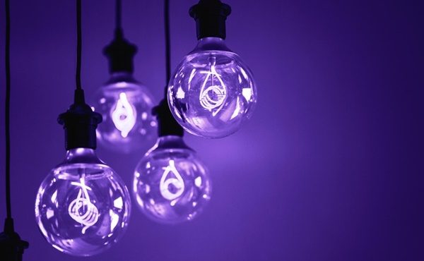
With ultra violet being chosen as Pantone colour of the year, what does this mean for the gift and homewares industry? What should retailers and wholesalers be looking out for?
According to Laurie Pressman, vice president of the Pantone Colour Institute, the Pantone colour of the year now means so much more than what’s trending and is a reflection of what’s needed in our world today.
“As individuals around the world become more fascinated with colour and realise its ability to convey deep messages and meanings, designers and brands should feel empowered to use colour to inspire and influence,” she explains.
“The Colour of the Year is one moment in time that provides strategic direction for the world of trend and design, reflecting the Pantone Colour Institute’s year-round work doing the same for designers and brands.”

When it comes to home décor, ultra violet can transform a room into one of extraordinary self-expression, according to the institute, or conversely its polish can tone down a room with subdued, modern pairings. Adding spice and brightness, it can make a piece of art or accent wall really stand out. In accessories, jewellery and eyewear, ultra violet suggests the complexities of natural gems, textures, and florals.
Executive director of the Pantone Colour Institute, Lee Eiseman, adds that as we live in a time that requires inventiveness and imagination, the blue-based purple takes our awareness and potential to a higher level.
“From exploring new technologies and the greater galaxy, to artistic expression and spiritual reflection, intuitive ultra violet lights the way to what is yet to come,” she says.
“Complex and contemplative, ultra violet suggests the mysteries of the cosmos, the intrigue of what lies ahead, and the discoveries beyond where we are now. The vast and limitless night sky is symbolic of what is possible and continues to inspire the desire to pursue a world beyond our own.”
The colour selected as the Pantone Colour of the Year 2018 was taken from the Pantone Fashion, Home + Interiors Colour System, the most widely used and recognised colour standards system for fashion, textiles, home, and interior design.
By Marion Gerritsen


