A new era brings in both novel and nostalgic approaches to colour and design, Lee Eiseman told the audience at the Pantone colour presentation at the International Housewares Show in Chicago.
The colour expert explained that this new era reinforces the notion that muted and vibrant tones can co-exist, and that a traditional style, especially when tweaked with futuristic touches, offers an unusual and original approach to a product or interior.
“The art world is a great place to find trends,” she says. “The crossover from the art world into trends is so much more important today. We take an almost Shakespearean approach and bring it into the modern world.
“Dutch retailers, for example, have integrated famous Dutch paintings into their store displays with great success. Also, sticking to the Dutch theme, the tulip is going to be the next big flower motif we will see in homewares. There is even a new vodka in the market that is based on organic tulips!”
Here are some of the home and interiors 2020 palettes to look out for.

Metropolis
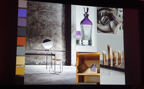
Metropolis speaks to big city living. It is a mix of glamour and industrial chic, of striated old-world marble and deepened wood patinas used with futuristic metallics. Accents of vintage plum wine and elegantly deep lavender add as sophisticated touch to this urbane and stylish environment.
Trekking
Trekking takes us away from the big city into the great outdoors―a place to escape the noise and the traffic, take a deep breath and appreciate our natural surroundings. This is a palette very much influenced by fashion favourites of plaids and flannels, of soft many-times-washed denims, of sneakers with a sheen or sturdy brown boots that were meant for walking.
Translated from fashion into interiors, this colour grouping invites a casual, comfortable unpretentious, no-frills-attached environment punctuated by the energy of red and the warming presence of a spicy mustard tone. A metallic steel wool adds a surprising and sturdy presence to the palette.
Skill Set
This is a palette that accentuates the skill sets necessary to create products that are utilitarian, functional, yet still refined, artful and engaging. We are reminded of valuing and venerating workmanship employed in many crafts, whether it be in the semblance of hand-hewn stone, hand-thrown pottery, hand-tooled leather, or hand-folded paper goods, forged steel implements, wine-dyed spoons rescued from old oak barrels, or in the skillful arrangement of wholesome food in a stoneware bowl. We look forward to new technologies that will enable even more complex finishes and colours.

Prints Charming
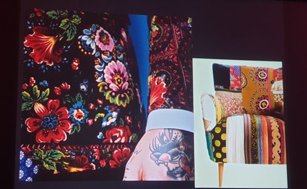
The interest in tattooing as an art form has grown to the point where patterning in interior textiles can provide inspiration for body art. The first part of this palette, appropriately named Prints Charming, calls to mind a sense of history and tradition, while at the same time introducing a cheeky and somewhat irreverent view of how traditional themes and modern-day usage might be co-mingled.
Beyond the Pale
Beyond the pale pushes pastels to another level. Reflecting its continuing popularity and expanding usage that will continue into the future, the pink family in several permutations is prime. In gradations of light, to mid, to bright tones, the various pinks and roses are muted or dusted, vibrantly bright or romantically inspired, with a sparkling presence.
They are coupled with complementary smoky greens, blue greens, a mid-tone infinity blue, or a lively greenish-yellow, and most effectively with a contrasting tawny brown.
Tempered Tastes
Tempered Tastes characterizes a contemplative, quiet palette, one that inspires softer and more intimate spaces and subtle colour choices. Charmingly understated, the mood is even further enhanced with the addition of shimmery metallic such as Pantone’s Gold Leaf and rose-toned Agave Nectar that lend an intriguing surface treatment to this discreet group of shades.

Show Stoppers
The vibrant hues in this palette could be described as both show stoppers and show starters, as the energy is implicit in the way the colours combine and effectively communicate with the viewer. It’s a palette that kids (or kids at heart) would be drawn to. It is about unabashedly attracting attention and making a statement, and the names of the colours help to tell the story.
Aurora Yellow and Spectra yellow are the headliners, most often paired with Deep Periwinkle. The momentum gathers as Red Orange enters the stage, forming a trio with turquoise and Purple Orchid. Twinkling Diode Blue and a whimsical green called Leprechaun Dust might very well be the star attractions.
Tea Garden
Very much reminiscent of the art of the Japanese tea ceremony called Way of the Tea, the colours and the mood imbued in this Tea Garden palette express a thoughtful aesthetic suggesting humility, simplicity, harmony, respect and tranquility.
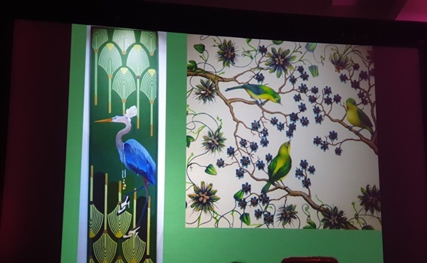
The colours used in this palette fit perfectly into the aesthetic―blue in the shades of sky and sea, serene greens and lavender, both matcha-toned, yellow-green and a pungent chai shade, and for a finishing flavor, a touch of mango.


