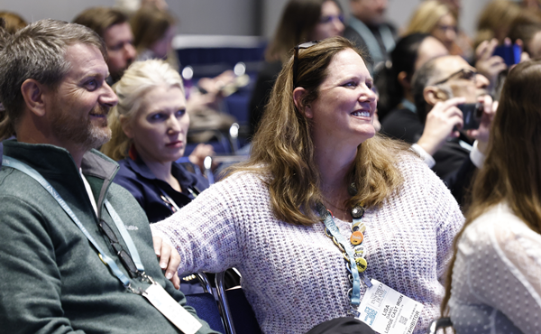
After two years of Covid lockdowns and restrictions, consumers are ready to emerge, experience new things, express themselves in new ways and explore the changed world around them, said colour expert Leatrice (Lee) Eiseman during her presentation at The Inspired Home Show 2022 held in Chicago from 5 to 7 March.
“More than ever before, there is an ability to connect with our consumer in a very personal way, enabling them to emerge from their personal challenges to experience and express new realities,” she says.
Featured colours in the Pantone View Home + Interiors 2023 forecast range from down-to-earth artisanal tones to highly digitised vibrant hues to intensely robust colours.
“There are always going to be people who are attracted to neutral colours. The difference today is that neutrals and high intensity brights can now co-exist.

“Likewise, there’s always a need for classic black and white stylings in home and housewares products. Bold red is always a top choice but mixing rose pinks and bottled greens give black and white a touch of newness these days,” she adds.
Mixing the old with the new also was critical when selecting Pantone’s 2022 colour of the year Very Peri.
“The decision was made to bring a novel perspective and vision to the most reliable, trusted and beloved blue colour family around the world. For the first time, we opted to create a new Pantone blue in order to symbolise our new realities and changing points of view.”
Palettes included in the 2023 forecast include:

• Tropic Refresh—“This is your place to dream big and enjoy, to escape from the challenges of everyday realities,” says Eiseman. Conjuring up images of sky, sand and sea, it offers a balanced feel with both warmth and coolness.
• Epic Tales—an escape of a different kind, this palette evokes the esthetic of medieval and mythical past, one that’s been popularised recently in gaming, movies and books. Robust and rich colours are featured, while metallics bring hand-wrought detail.
• Honesty—a simple colour combination that suggests health and wellness. “It features neutral colours that are joined by some nourishing vegetal yellow-green shades that are set off by a sole blue green,” adds Eiseman.
• Earthbound—this palette has a utilitarian look with earth tones mixed with some metallics for an updated approach. “It reflects the fact that people are longing for that ability to reach out and touch right now.”

• Unexpected Reality—“Lighter pastel shades are contrasted here by, yes, unexpected bright hues including a vibrant yellow, a sulfuric yellow-green and a bright orchid,” says Eiseman. There is an undertone of technology that energises this palette.
• Artisan Invention—drawing inspiration from the boho trend and manipulated fabrics, Artisan Invention has an eclectic effect that is both rustic and sleek, says Eiseman. Mixing the old with the new is a theme here as well.
• Intoxicants—it’s all about brightness with Intoxicants, though there’s a bit of mystery involved too. “Purple, magenta and violet are joined by red, green, orange and an electric blue to express celebration and aspiration for better days ahead,” she adds.


